PowerPoint presentation: how to reduce cognitive load for your audience?
Learn our top tips for creating PowerPoint presentations that reduce cognitive load.

Do you remember your middle school, high school or university courses, when the teacher talked without pause, in a monotone tone, for 2 hours... and you ended up losing track? This unpleasant feeling of boredom and mental fog often leads to frustration.
The regulars of PowerPoint creations are always concerned with the concentration and good understanding of their audience. Her commitment is essential, so cognitive overload must be avoided. Follow us to understand this concept, and create presentations that promote the transmission of your messages!
Cognitive load: definition and principles
What is cognitive load?
Let's start with the serious stuff and talk about definition: the concept of cognitive load was developed by John Sweller, an Australian psychologist, in 1956. To put it simply: any learning activity requires the brain to mobilize resources, which are not unlimited.
The brain divides the work of assimilating information into several categories, which are also called “burdens”:
- The “intrinsic” load: process and connect information to complete a task.
- The “extrinsic” burden: identifying and discarding unnecessary information from The ones to remember to get the job done.
- The “essential” load: we are talking here about learning itself, which consists of building and mastering knowledge, to keep them for the long term.
The first lines of thought about cognitive load
Ok, now that we understand the concept of cognitive load, what do we do with it? The theory considers that during learning, if the intrinsic and extrinsic loads are too dense, the brain no longer has enough resources to focus on the essential load, and therefore, to learn.
So you have to think about solutions that facilitate learning, so that the information transmitted is correctly retained. Here are a few examples:
- Clarifying relationships enter information to build a logical learning path;
- eliminate as much useless information as possible, and keep only the relevant items for the message;
- use words and definitions clear and concise ;
- Repeat terms essentials ;
- present information under different angles, so that it is fully understood.

The cognitive overload approach in design
In the world of design and the creation of visual materials, professionals are well aware of this subject. Let's talk then “digital ergonomics”, to define a well thought-out support to effectively deliver a message.
There is a specialization for design professionals, which consists in putting themselves in the shoes of the audience during the production of visuals: we call it The “UX Design”, in other words “user experience design”.
We leave from The viewer's point of view to create a support, in order to more easily identify the elements that cause cognitive overload. To do this, it is necessary to promote an intuitive, easy to understand presentation. From the first few minutes.

Create a balanced PowerPoint for your audience
Understanding cognitive load to better avoid it
To combat cognitive overload and facilitate the transmission of the message, design professionals take into account several factors :
- They are thinking about the complexity of information to understand, by identifying the number of elements to be processed, connected and linked, to create logical thinking.
- They find out about their audience, to know the nature and level of each person's resources (general knowledge, professional context, career, knowledge of the specific subject...).
- They take into account how the information should be presented, to match the business and presentation context (product launch, corporate presentation, event-based, internal communication...).
Reduce cognitive load to optimize your message
UX design experts adhere to several principles, which allow them to produce content that reduces the cognitive load of the audience. In this way, they ensure that the message of their presentation is well understood by the audience. Let's look at these principles together:
- The Principle of coherence, which consists in removing all non-essential information, so as not to overload the PPT presentation and focus the audience's attention on the key elements of the message.
- The principle of redundancy, which offers a well-thought-out design, skilfully combining images/diagrams/ graphs with text and narration. The aim: to get the audience to quickly understand the central message.
- The Principle of modality, which consists in highlighting the most relevant elements, making the most of the graphic software options, that is to say PowerPoint in our case. Audience attention can be strategically directed using bold, italicized, arrow, and other forms.
- Finally, The theory of attention, which considers 2 types of attention. Top-down attention is driven by the search for a specific response, and bottom-up attention is guided by learning. Designers must therefore think about the type of attention of their audience and compose their slides accordingly.
How do you build a slide that doesn't make too much noise?
After learning all these concepts, we wonder what a PowerPoint presentation including the design reduces cognitive load as much as possible of the audience.
Indeed, an overloaded design disperses attention, creating what is called “visual noise”. Let's see together what the ideal, low-noise slide includes:
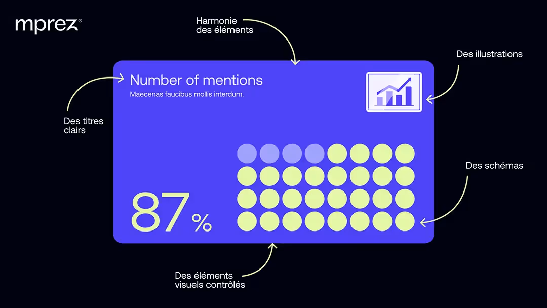
- One Harmony of the elements : no differences in Typography and icons, no color shocks, no parasitic information.
- Of clear titles : each slide starts with a hat that guides the thinking. It can be a question or an assertion, so the audience can focus on the important content that follows.
- Of interactive elements : they encourage learners to think actively about information, and encourage their participation, for better attention.
- Of controlled visual elements : each slide must limit the quantity of visual and sensory stimuli, seek a balance between movements, animations, bright colors, and text blocks. The information is better retrievable.
- Of illustrations to explain terms: the audience spends less cognitive energy when they associate a word with a picture.
- Of stencils to summarize learning : they allow you to repeat the message in a simplified way, to fix it in the audience's memory!
Integrate the concept of “less is more” on PowerPoint
What is the concept of “less is more”?
The principle of “less is more” seeks to maintain a simplicity of design. This concept is based on 3 observations:
- A simple design promotes concentration of the viewer and the clarity of the message.
- To say less is to engage more: we stimulate curiosity and reflection, and we reinforce the Weight of the message.
- A simple visual contains only the essential information: since they are not parasitized, their Credibility is multiplied.
This principle is close to the Minimalist design wave, which is applicable in many fields, including art, architecture, communication and visual creation.
Sobriety on PowerPoint: does it really work?
Choosing to apply the “less is more” principle to the creation of PowerPoint materials means emphasizing the simplicity of the design. The objective is to look for a clarity of the visual, to fully push its function as a message bearer.
Sometimes, we can go so far as to obtain an almost uncluttered visual: we then speak of “negative space”. The idea? Use empty space as a design tool, as an integral component of the slide: the ventilation of the visual highlights the information to be retained.
Finally, the “less is more” concept makes it possible to create a design that is graceful, balanced, light and, above all, useful. It prioritizes the quality rather than the quantity of the elements present on the PowerPoint, for a clean and impacting rendering.
Avoid negative factors and focus your message properly
However, one point of attention (without wanting to create cognitive overload, don't worry): remember that the concept of “less is more” does not only apply in visual design. It must also be included in the accompanying speech.
Adopting this principle means remembering your general strategy for reducing cognitive load at each stage. The aim is to arrive at a final presentation that is consistent across the board, while getting your message across successfully.
Finally, if you choose minimalism for your PowerPoint visuals, remember to cherish your extravagance and the richness of your brand. Be careful not to neglect your visual identity, and to stay aligned with your graphic charter. It would be a shame to lose your originality and everything that makes your brand magic!

We hope you finish reading this article with clear ideas about the concept of cognitive load. To summarize, create a PowerPoint presentation that avoids cognitive overload, is: simplifying and clarifying information, explaining the logic of reasoning, facilitating access to essentials and limiting distractions.
By reducing visual noise and extraneous information, you ensure a better concentration of your audience. If you want to be accompanied forYou feel like you can't focus, and you end up feeling like you're missing out on what you're here for. But don't panic: this feeling is completely normal and common! It's called cognitive load. , our mprez experts are there to advise you!