Color psychology to control your audience's emotions
Colors are all around us and help convey clear, if unconscious, messages. Mastering colors means mastering the minds of others.
⇒ 84.7%.
This is the percentage of people who, according to the panel interviewed by CarlFritz.net, admit to being influenced by colors in their purchases. Product colors, labels, banners, everything is there.
⇒ 40%.
It is the percentage of additional attention that a colored label receives compared to colorless displays.
⇒ 90 seconds.
This is the time it takes for a consumer to know if they will buy the product shown or not.
These parameters seem like nothing, but if you put them together correctly, they represent a large part of the decision in your favor.
So, are we talking about colors?
They are all around us and contribute to sending clear, if unconscious, messages. In a world where our most important sense is the visual, we have every interest in putting neuroscience into our pockets and using the psychological impact of colors.
Chase the natural, he's back at a gallop
We would like to see our species as an evolved collective that is remote from its primary instincts. Lack of luck, Man has remained very primitive, especially in his unconscious perception of the world!
Our system of reference and approach to the outside world is always based on a natural knowledge of things and is totally on the periphery of our conscious understanding. We perceive things almost immediately, without even rationalizing them, and put them into small, well-segmented boxes in order to better understand what's around us. When you see a green clump above a brown cylinder, you think directly of a tree, right? It is your brain that plays this little trick on you by associating images, sounds, smells or even touches, with tangible things that you know and recognize easily.
The same is true for the psychological perception of colors. They are linked to our previous personal or common experiences with the species and are part of your reference system. This system is designed to protect you and train the activation of your reflexes.
For example, the color red is naturally linked to blood, in the collective imagination. This makes it a color associated with danger, alertness, and energy.
The color green is associated with trees and nature in general, which is why it is confused with ecological and health issues.
So you still think you're in control of your brain?
In the color family, I would like...
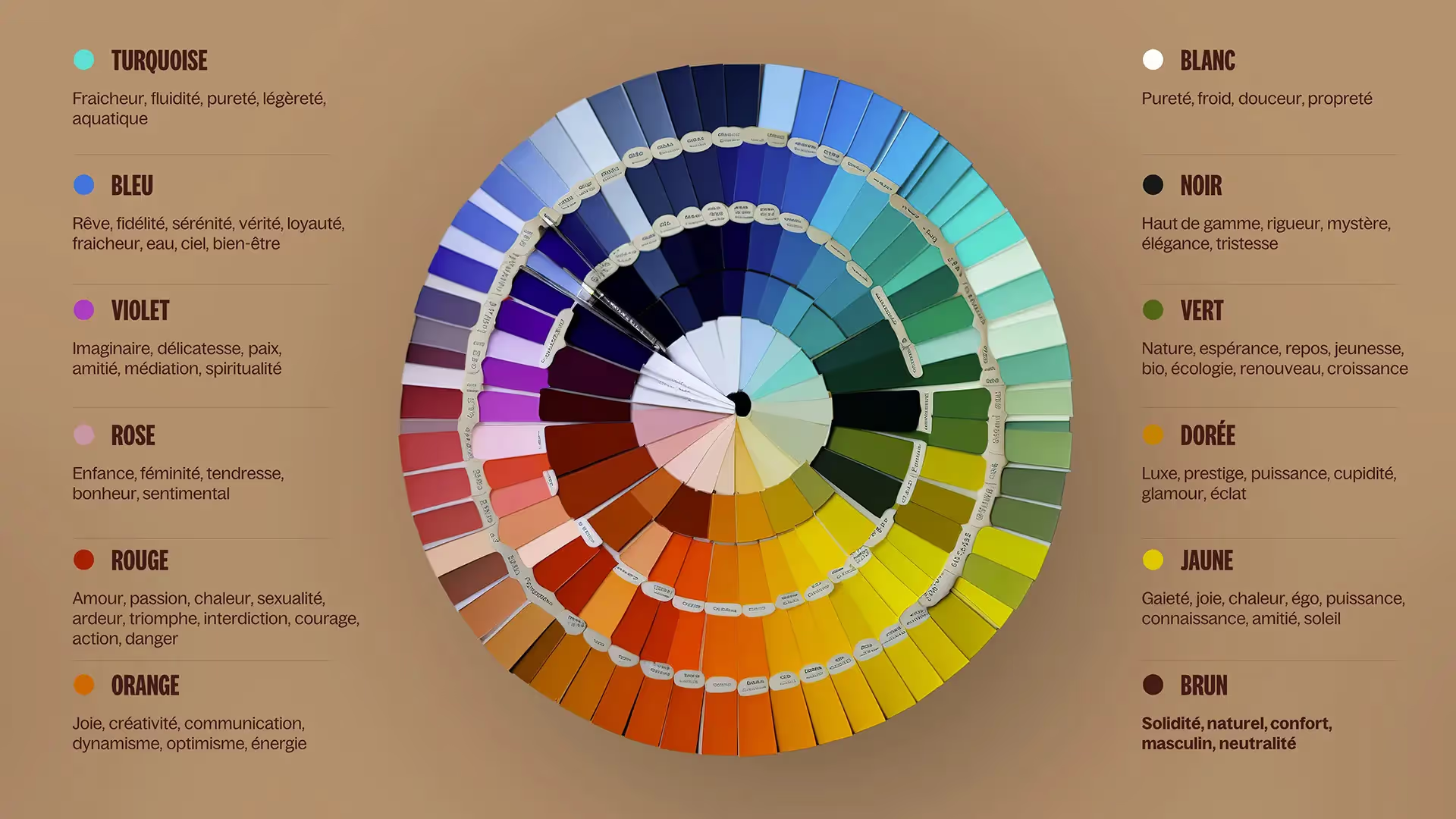
Each color is linked to a specific atmosphere, to a defined message. In this context, it is imperative to master the hidden meanings relating to each of them, in order to adhere to your general message and avoid missteps.

We give you a summary of the color-meaning relationships:
- I would like some ruddy :
Red is a rather strong warm color, which conveys vivid emotions. It is associated with blood, and therefore with impulsiveness, energy, energy, action, danger (the prohibition signs have fully understood how our brain works) and attention.
It is used for information of extreme importance, to ensure a lasting impact on the public.
It is found on road signs, on labels that prevent danger (flammability, intoxication, etc.) or for presentations by high-impact companies, which adopt strong and lively communication (Coca-Cola, Red Bull, YouTube, etc.).
⇒ The neuroscience point: red animates the amygdala and the nucleus accumbens, which are directly linked to the alert system and behavioral orientation, as well as the feeling of pleasure and desire (via the reward system).
- I would like some unripe :
Green is a reassuring color that communicates feelings of calm, calm, and fullness. It is associated with nature, health, ease and happiness (why is money always represented by greenbacks? In the imaginary world, money makes you happy).
It is used to convey positive messages, often with ecological and ethical tendencies, since green reminds us of trees and the Earth.
It is found on many environmental labels and on so-called “healthy” communications; companies use and re-use it to give themselves a more eco-responsible image. Green graphic charters therefore include wellness brands such as Yves Rocher, as well as brands seeking to “greenwash” their practices, such as Starbucks.
⇒ The neuroscience point: green animates part of the prefrontal cortex that manages decision-making, as well as abstract and creative thoughts.
- I would like some bruise :
Blue is a cold color, which inspires serenity, calm, reliability and seriousness. Blue is a color called “appetite suppressant”, therefore ideal for promoting concentration and productivity, but very not recommended for food industries. It is associated with the sea or the azure sky, and therefore with dreams and travel.
It is therefore widely found in travel charters (Booking, Club Med, Blablacar), in others related to communications (Facebook, Messenger, Outlook, LinkedIn) or even meditation applications (Calm, Petit Bambou).
⇒ The neuroscience point: Blue activates the prefrontal cortex, which manages planning and deductive reasoning. Dark blue has a direct link with The power.
- I would like some yellow :
Yellow is a warm color that infuses an idea of dynamism and joy. It is the color of optimism, but also of promotions and “bargain prices” (the famous fluorescent yellow labels in discount supermarkets). It is associated with the sun and heat and, unlike blue, it is a color that leads to hunger.
Yellow is the color that the human eye first sees, so businesses looking to catch the eye of their consumers use it a lot.
It is thus found in businesses related to food, often cheap, such as McDonald's, Lidl or Lay's, as well as in companies that invite dynamism and action, such as Snapchat, Nikon, Nikon, Fnac or Ferrari.
⇒ The neuroscience point: yellow activates your brain's reward system.
- I would like some purple :
Purple is a warm color that is not easily combined with other colors, as it can quickly appear noisy/busy. It is linked to mystery, extravagance, and spirituality. Some shades can be matched to a luxurious image, too. In nature, purple refers to details, such as certain flowers, but it is not common to find it. It is therefore used by businesses that want to stand out from their competitors.
It is therefore found in business charters in competitive sectors, such as food (Milka and Cadbury), communication (W9, Yahoo, Twitch) or even travel and travel (FedEx, Mercure).
⇒ The neuroscience point: Purple stimulates the frontal pole, which is linked to actions and their planning, to movement, and to abstract thoughts.
- I would like some brown :
Brown is a warm and very natural color. It inspires authenticity, security, reliability or even gluttony. In nature, it is reminiscent of trees and the earth, which are tangible and unchanging elements around us, hence the idea of safety and reliability.
It is found for gourmet food companies (M&Ms, Nespresso), who want to be reliable (Amazon -even if its brown is orange-, UPS) or who are committed to representing heritage and immutability (Le Conservateur, logos related to remarkable heritage sites in France, Chaussée aux Moines).
⇒ The neuroscience point: Brown activates the limbic system, the internal structure of the brain that responds to emotions.
- I would like some black :
Black is not a color strictly speaking, but it is very often found in the logos and graphic charters of companies, especially those in the luxury sector, to which white is associated. It is the color of elegance, mystery and function. It is also associated with mourning and sadness in Western countries.
It is found in luxury companies (Chanel, Gucci) and high-tech companies (Apple, Samsung).
⇒ The neuroscience point: the dark activates the amygdala, which regulates sexual behavior, aggression, fears and emotional memories.
Are you up to speed with colors? Let's see what some companies have undertaken in terms of their graphic charter to inspire their universe.
Businesses, psycho' biases and me
As we have seen, colors affect several areas of our brain and transmit a message that underlies the purely visual idea that we see. Large companies understood this well, and the work of their graphic charter was not carried out without this consideration.
So, what did the great mastodons of this world want to tell us through the colors chosen?
- The deceptively ecological green: the example of Starbucks
Formerly brown, the Starbucks logo - and, at the same time, their entire graphic design - turned green in 1992. It is a bottle green that then adorns the brand's communication, the color of money and prosperity. Today, this green has brightened, and some might think that it is related to ecological commitments.
This is often what we think of a green logo (and it is for this reason, associated with health, that McDonald's, for example, changed its famous Branding red in green), and we're looking no further. Does Starbucks have a green logo? So their products must be eco-responsible, or from ethical agriculture.
Your brain has skewed your ability to judge because of color. Because who tells you, apart from a Branding green, how environmentally friendly is Starbucks? Absolutely nothing, and that's where the power of color is. Especially when you know that Starbucks raw materials come very weakly from fair farming (and Starbucks has created its own label, CAFE Practices, to distort the results) and that all their products - frozen - are received in individual plastic packaging. That's what the color bias is hiding from you.

Unfortunately, many companies use a green graphic charter without real ecological intentions, which can misread unconscious messages. It is essential to remain alert to the visual information that can be found around us, in order to maintain an unpolluted critical mind through colorimetry.
- The red of vitality: the example of Coca-Cola
As we've seen, red is the color of responsiveness and action. Our mind is immediately stimulated by red dots or spots of this color. We want to see what's going on as soon as we see this color; it's our hunting instinct that wakes up.
That, the creators and marketers of the image of Coca-Cola understood it well. They designed a bottle with an iconic red band, easily spotted on the shelves. We see red in a supermarket and we Recognize Coca-Cola. They don't even have to put their logo on a colored label anymore, because our brains do their job for them.
If you look at their source website, you will notice that it is extremely white. The only thing that stands out, therefore, are the Coca products and labels that they highlight through videos or photos.
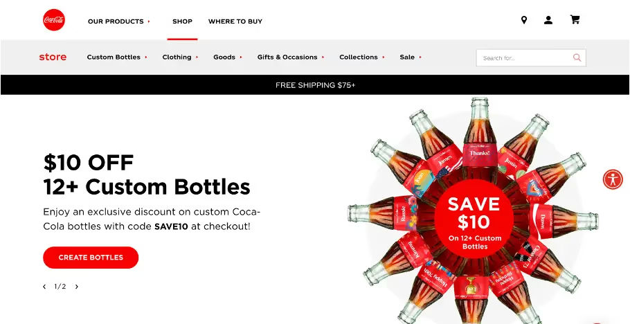
And this red color, in addition to its visual strength, was chosen for its subliminal message. When you see a bottle with such a color, your brain will naturally think that the drink will Booster its performances and give you energy. That's the impression you can get from Red Bull's red bull, too. And it has a direct relationship to the components, since Coca-Cola drinks are rich in caffeine and sugar, which is the ultimate stimulant.
So the circle is complete: red gives you psychological energy, and you drink the content that gives you indeed a peak of vitality through its sugar concentration. As a result, your brain will continue to associate red with sugar and the dynamism it provides, and the circle gets inflamed.
In practice, what does that mean?
Undoubtedly, you are now fully familiar with the role of colors in communication and the biases they generate!
What if we moved on to a small practical case, to help you associate the right colors during your prez, or your overall graphic charter?
- You are a high-tech company that is fairly new to the market
As we have seen, the color par excellence of high-tech is black, often associated with metallic gray. Today, almost all phone brands use this duo. Others use black, but associate it with a sharper and less conventional color, such as Back Market, which, for many of its communications, combines black with green/fluorescent yellow. The contrast is thus significant and differentiates it from competitors, which also fits quite well with their segment of activity focused on refurbished high-tech, and therefore out of step with the proposals of other companies.
This less traditional black-color pairing can indeed be a good combo in the corporate jungle that we find today. This can help you see yourself above the crowd and stand in the opposite direction from your competitors.
What if you used purple, combined with black, which is the color of mystery and change? Or orange that combines the action of red and the dynamism of yellow? Good news for all new companies that want to revolutionize their sector of activity 😉.
- You are a family business
Family is sacred. A bit like traditions and heritage. As we can see, the color of sustainability is brown. It recalls the land, the know-how and the age of the past. It gives cachet and legitimacy, subconsciously, for all those who observe a charter or a presentation in natural tones.
The advantage of brown? It comes with many other tones! Taupe, beige and cream will be your friends to combine the elegance and respectability of dark brown with a touch of modernity and purity.
- You are in fashion and/or ready-to-wear
Luxury is mostly made of black and white, as Chanel so well personifies. It can also be available in brown tones, to remind us of respect for traditions, such as the famous Louis Vuitton line.
But the beauty of fashion is also its originality and its extravagance. Fashion is not attached to one color, it is multi-colored. Today, ready-to-wear is very diverse in terms of colors and graphic charter, which allows you to give free rein to your creativity. Gemo is green, Gap is blue, H&M is red, Camaïeu is pink (we can still talk about them since their return was recently announced by the Youtuber Léna Situations), etc. All proposals can be heard and defended.
Did we say fashion is creativity? Doesn't that remind you of a color? What if purple was The New Black ?
La prez only has to be careful
Because we can't help but talk about prez PPT all the time, here are the ultimate tips to use specifically to enhance your presentations.
- The dark side of Slide
What should you choose, between a light background or a dark background, to highlight your words?
First, think about what you want to say in your Slides and, above all, to the consistency of the information. For example, supported content is more legible on a light background than on a dark background.
If, on the other hand, you decide to insert Slides “dividers” -which serve as a summary throughout the course of your prez-, do not hesitate to blend them into a darker color, so that they can stand out in your panel of Slides. These”Slides Respiratory notes” generally contain little text and are suitable for the insertion of an image or that of a predominant text on a dark background.
- The colorimetric holy trinity
In the wonderful world of presentation, there is a rule by which you can't go wrong with your visuals. It is simply a matter of defining three distinct colors for the whole sa prez: a light color for the Slides of text, a dark color for Slides of breathing and an accent color in order to highlight certain elements (words, pictograms, etc.). Always segment your information according to this triptych (which you can obviously reverse if you want to, the idea being to maintain a global unit).
Do you want another Tips ? Use a different accent color for each part of your prez to evolve your pitch and remove any confusion in your audience's mind.
The end clap
To conclude after this wealth of colorimetric information, we must therefore remember that the choice of colors in your graphic charts, logos and presentations (internal and external) is essential.
Aesthetics is not the only master of your visual communication; the unconscious also plays a great role that needs to be filled.
Play with common reference systems and the psychology associated with each color: these are powerful weapons that can allow you to convey several messages during your communications, both an explicit message and a hidden message. It would be a shame to pass only half the information.
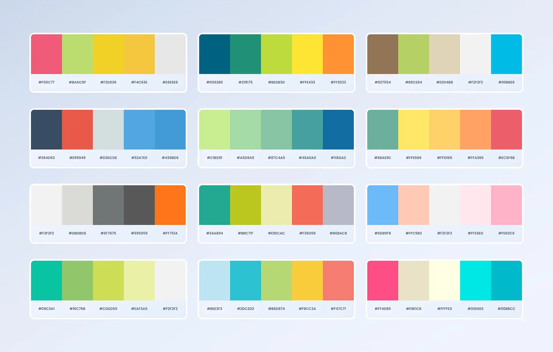
In addition, you will not be able to put all the colors of the rainbow in your presentations, even if you are dying to and each color recalls a specific message in your press release. You will have to make choices to harmonize your prez and that they are pleasant to the eye (we'll let you come back to the image above which has good color combinations).
On the other hand, always think about the presentation conditions! Some colors cannot be seen well if they are poorly tuned (e.g.: you cannot see white well on a pale yellow background... and even less with a video projector), it is therefore essential to do tests beforehand and to consult color harmony guides, to be sure of the mixtures made.
Finally, the most important thing is to remain consistent with your graphic charter and brand identity. A presentation is the external image of who you are, so stay true to yourself!
If you want to learn more about combining colors and creating harmony in your presentations, our creative experts are available to help you!
See you soon at mprez, the Powerpoint agency par excellence! 👑
Ce qu'il faut retenir
- Each color is linked to a specific atmosphere, to a defined message.
- Each color influences a specific brain area that has consequences on our actions and reactions.
- Some brands trick you thanks to their colorimetric choices.
- Use a triptych of colors for your prez: one light, one dark, and one accent.

