The harmony of the visuals in your PowerPoint
You don't mix tea towels and napkins, but you can mix visuals!

Harmony represents one of the essential pillars of information design, encompassing the harmonization of fonts, color associations, and any other graphical features within any visual interface. It makes it possible to enforce the visual identity of a brand and to improve communication media.
At the heart of this quest for visual balance are illustrations. While it is undeniable that the use of illustrations is fundamental to slide design, it is crucial to recognize that their full power comes into being when slides are designed. share a link and a graphic linearity. This graphic synergy between illustrations enriches visual communication and gives visual coherence to your presentations, thus captivating your audience in an even more powerful way. Let's discover together how this visual harmony can transform the impact of your presentation designs.

To begin our exploration, let's quickly clarify the concept of illustration. This term encompasses three main forms in the context of presentations:
- In the sense of visuals/images
- In the sense of illustrated sketches
- In the sense of pictograms
Understanding these different forms of illustration is the starting point for optimizing the visual impact of your slides. With these options in mind, the next step is to find the right resources and use a consistent style to illustrate multiple concepts in your presentation. The objective is to create harmonious visuals that are part of the same visual universe.
1 - Harmonization of visuals/images
Harmonizing images in a PowerPoint presentation is a key element in creating a consistent and professional appearance. The images used in a presentation can have a significant impact on audience engagement and message understanding, which is why it is important to build a clear visual unit.
First of all, it is important to choose a consistent visual style for all images in the presentation. This may include using similar filters, colors, or styles for all images. Next, we recommend using frames and borders to frame images and create a consistent appearance. Frames and borders can be customized to match the look and feel of your presentation.
Another way to harmonize images is to use visual effects such as drop shadow, reflection, or brightness to create a cohesive appearance. These effects can be applied to all images in the presentation to create visual unity. It is also important to consider the size and resolution of the images used in the presentation to ensure optimal image quality. Images should be resized consistently to fit the layout of the presentation.
The image banks that we recommend
When it comes to images, avoid Google Images and photos with the Shutterstock filter.
Instead, choose free banks such as unsplash.com or Pexels.com, offering quality photos in free access. Even if the images selected are of high quality, add a filter to create visual unity.
A little tip for customizing images and integrating your text into them:
1- Create a shape
2- Adjust its fill color
3- Apply transparency to let the photo appear
4- Apply this approach to all the photos in your presentation.
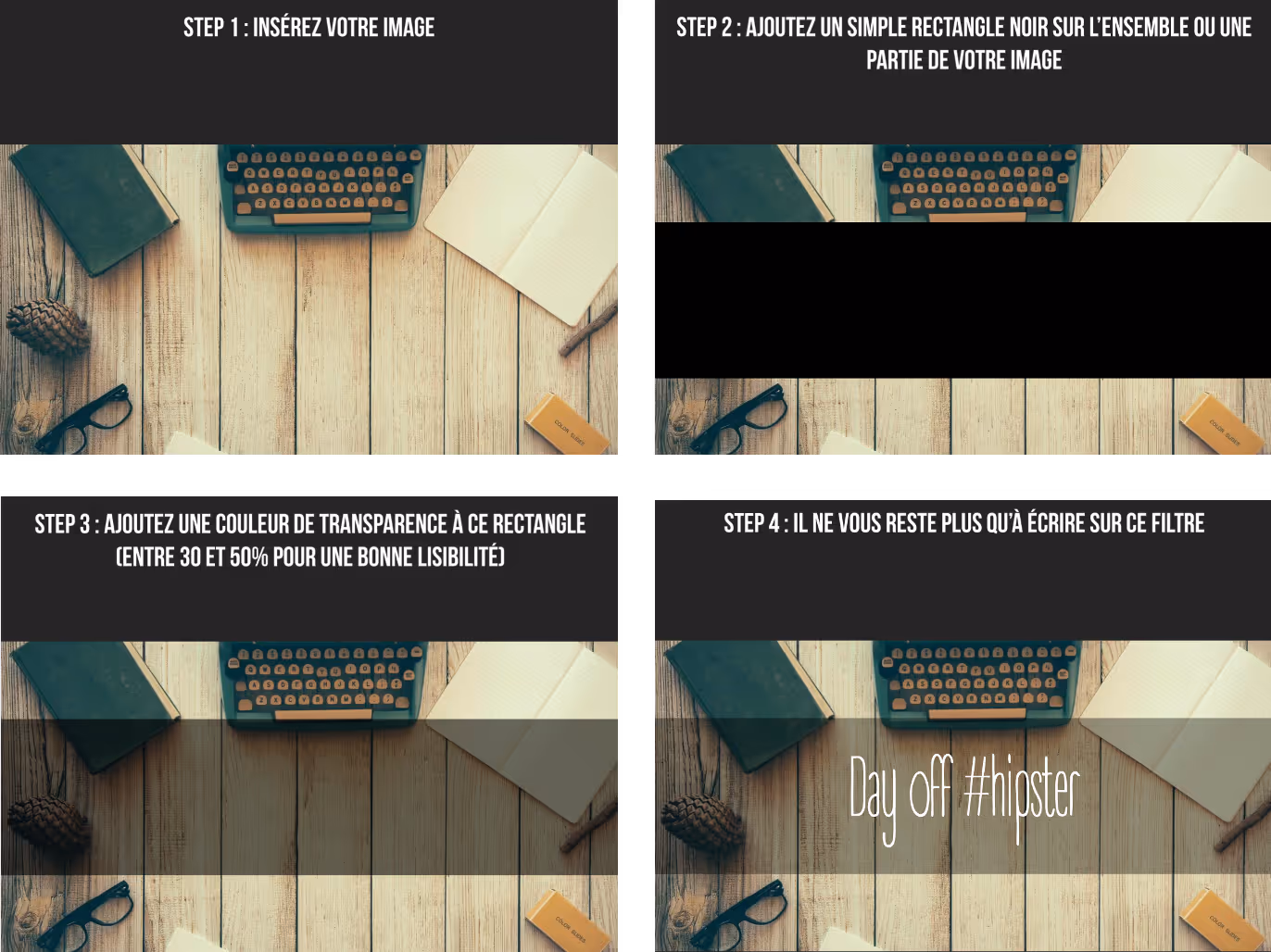
By following this process, writing on a photo has never been easier.
2 - The illustrated sketches
An exciting alternative for bringing your ideas and concepts to life in a presentation is The use of skits. These visual mini-dramas place characters in a variety of work scenarios, whether it's a business meeting, a data calculation, or the presentation of a strategy. This approach offers a refreshing and modern design, making it possible to avoid the overexploitation of “corpo” visuals that are sometimes too conventional.
When opting for the use of sketches, make sure to create or use illustrations from the same illustrator. This artistic coherence contributes to the visual harmony and overall aesthetics of your presentation. For this purpose, the mprez® agency offers a free PowerPoint template and ready to use. The latter is full of numerous illustrations that will illuminate your slides dedicated to the world of business and enterprise.
The illustration banks that we recommend
- Undraw : you can customize the illustrations with the color palette of your graphic charter
- Sketch Valley : for various illustrations in color or black and white

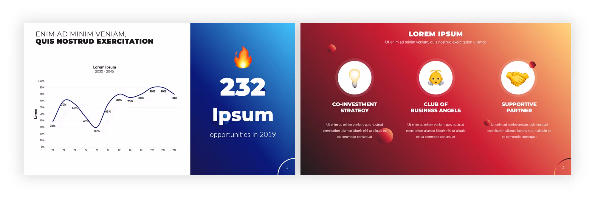
3 - The pictograms
Pictograms remain essential when it comes to to illustrate your PowerPoint slides. Their use is not only a current trend, but it remains and will remain an excellent way to offer clear visual references, thus structuring your slides and easily reinforcing your concepts. Pictograms simplify explanations, make it easier to remember, and improve the overall design of your presentation.
Integrate them without restriction
Do not hesitate to integrate these small graphic elements without counting. Their power lies in theTheir ability to simplify complex ideas. Pictograms are reliable visual companions, allowing you to deliver your messages in a concise and compelling manner. Some pictograms have become indispensable and are the universal sign of certain ideas (for example, a traffic sign with an exclamation point is a sign of important information that deserves attention or a magnifying glass indicates a detail or a particular point of attention on a subject, etc.). Use them simplifies your presentation and makes it lighter, making it much easier to read.
Opt for the SVG format
Valuable advice: Always include pictograms in SVG format in your presentations. This tip gives you the freedom to customize the color according to your needs, thus bringing a personalized touch to your creation. This aspect is essential to integrate all your elements into your graphic charter, thus strengthening your brand image and the coherence of your visuals. By promoting the use of elements in your graphic creation, you improve your communication tools in their entirety and give a feeling of professionalism.
Visual harmony with pictograms from the same bank
Maintain visual consistency by using pictograms from the same bank. Whether you prefer fine outlines or solid pictograms, Be sure to choose a consistent style for all of your icons.
In the same way as color variations, maintaining a consistent pictogram reinforces your professional attitude and the overall harmony of your document, which is essential for maintaining your brand identity.
The pictogram banks that we recommend
Finding the right pictograms is sometimes not easy, so we recommend a few sites to make your search easier.
To find happiness, you can explore:
These pictogram banks will allow you to discover a vast selection of icons that will perfectly match your style and the essence of your presentation.
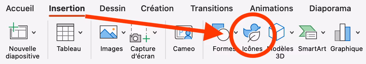
In addition, the software PowerPoint Microsoft also has its own pictogram bank., available in the “Icons” tab symbolized by a little duck and a leaf, in your display bar.
Elevate the aesthetics of your slides with carefully selected pictograms.
How do I integrate my pictograms into my presentation?
- If you use the PowerPoint icons available directly on the software, nothing could be easier: go to insert > icons > select the visuals that interest you > “insert”, and that's it, your pictograms are integrated as you want!
- If you have found pictograms on other databases, download them and put them on your desktop. Once they are on your desktop or in a specific folder, you can integrate them into PowerPoint by “drag and drop” or by inserting an image using the PowerPoint “insert” command.
You can then rotate, change the color, or resize the pictograms as you like to fit your slide.
BONUS: the emojis alternative
Created in the 90s by the Japanese designer Shegetaka Kurita, they have completely entered our daily lives, often relying on text in our conversations. Using them in a presentation can be very coherent, providing a fun and powerful tone. Not to mention that they provide an easy solution to our question about harmony since we can consider them as a bank of pictograms of the same style.
Small clarification: you can find emojis directly from your PowerPoint interface in the “Insert” tab then “Symbol”: they are now available “natively” on the software.
Ask for help with your visuals
If you feel overwhelmed by the rules of visual tuning or if you lack the time to take care of the aesthetics of your presentations, there is PowerPoint agencies Who can help you quickly and easily.
A graphic design agency (also called a graphic studio or PowerPoint agency) is a company specialized in creating, designing, and producing professional presentations. They can also offer graphic design, content writing, and project management services to help you create consistent and effective presentations. An agency will help you bring out the best in your prez, to obtain an aesthetic and professional result according to your initial guidelines.
In addition, agencies generally offer PowerPoint courses, also, which allow you to become more familiar with the tool, so you can then create the most beautiful slideshows yourself. These courses can be an opportunity to learn or re-learn how to harmonize your slides and illustrations, for breathtaking renderings!
To finish...
Visual harmony is not limited to aesthetics: it is a powerful tool for making an impression. Logos, fonts, layout... each element contributes to a strong and coherent visual identity.
Tools like Canva and Illustrator make it possible to bring your creations to life, but to go further, expert support makes the difference.
That's where it comes in Mprez, a specialist in presentation design, who helps you transform your slides into real impact supports. Focus on powerful visual communication and let your creations tell your story.
Ce qu'il faut retenir
What you need to remember:
- No need to spend money on image banks: there are great, free ones out there!
- No need to use Photoshop for a professional result: Powerpoint already takes care of it very well!
- Use pictograms and emoticons for more clarity and dynamism!