The use of grids in PowerPoint
Discover an essential tool for any presentation designer: PPT grids!

Powerpoint grids are essential tools for creatives. They are essential composition and structure devices for layout a document. A grid is the skeleton of any creation and allows designers to greatly enrich their work, whether creatively or conceptually.
This device is found in many trades, also called “canvas”, “model” or even “support”, but the common point is that it is a valuable aid in the development of any project. The major advantage of the grid is in particular its disappearance during the presentation, which makes it a magic tool that can be used for creation, but not cumbersome for the future!
Let's learn more about this everyday tool.
The areas of action
Grids can be used for several formats and several uses.
Overall, grids allow for rigorous work throughout the creative process, by allowing alignment to be respected, in other words, whether the elements are on the same vertical or horizontal line. Respecting a certain symmetry, which is so important to the human eye, is easier; you can then insert symmetric elements or deliberately break symmetrically. They are also essential to respect margins and reserve areas; once installed, they are good visual references useful for any insertion or movement of elements. If you want to enlarge or narrow an object, they will also be used to respect the proportions and keep the ratio accurate. The distribution of the elements in the sheet is facilitated by the division of the space into distinct and identical squares; no more blur or instability in the visuals!
In addition, grids have become great tools applied to digital technology, since a grid makes it possible to adjust horizontal content to a vertical format. Choosing a large number of columns makes it possible to promote multiple digital configurations: 12 is frequently used, because its multiples are abundant and therefore easily applicable.
In short, grids are therefore ideal for:
- The composition
- Respect for proportions
- The division of space
- Adapting to digital
Using grids means improving reading comfort for the audience and perfecting the hierarchy of information and the structuring of balance for the designer.

Anatomy of a grid
What exactly is a grid made of?
There are six significant elements in a grid:
- The margins: they surround the creative space at the top, bottom and sides.
- Columns: they structure the page and divide the space into proportional spaces.
- Lost funds: they extend beyond the edge of the page to guarantee the printed area.
- The gutters: they ventilate the separation by columns by guaranteeing white spaces between each.
- The lines of force: they are indicators to make it possible to identify the important elements on a page and to give a certain dynamic.
- Strengths: obtained by dividing the format into thirds (3 rows and 3 columns), they form the places where the eye naturally looks.
Assembled, they make it possible to manage all the issues related to grids and layouts.
The tip's created
You'll see that most editorial layouts are sequenced in three columns. This phenomenon is due to the rule of odd numbers, which presupposes that it is more interesting to work with an odd number of elements to play on combinations of symmetry and asymmetry.

Use on PowerPoint
As you have understood, grids are the central nerve of graphic creations, and this of course applies to PowerPoint. Indeed, by using this tool on PowerPoint, we obtain a much clearer and more structured breakdown of the slide, which allows optimal content creation. Using the rule of odd numbers, for example, we get segments in triptychs, which is always interesting to use, especially to favor a Meaning of reading adapted to the tool. You can create much more airy content and Slides which combine alignments and breaths, through an orderly circulation of blanks that allows an assured focus on the content, through the overall readability obtained.
What if we started?
On Powerpoint, two ways to use grids in practice.
- You can “set-up” your own and create your own settings.
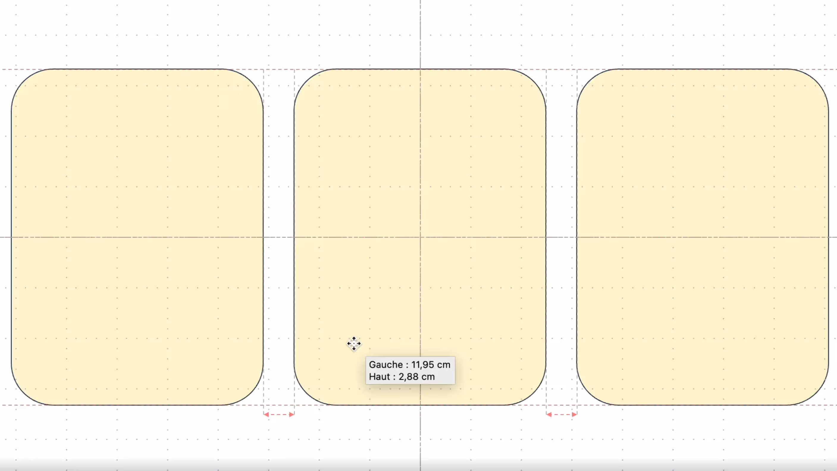
- You can use a dynamic grid, which will give you the necessary information based on your actions (for example, the software will inform you, when you move an element, that you are X distance from the edge or from a similar element).
In both cases, go to “View” and then to “Grids and guides.”
By checking “Gridlines”, a dotted grid appears on your screen. By selecting “Guides”, other lines intersect the page in the middle, forming four equal areas, as well as on the sides.
By going to “Grid Options”, you can change the characteristics of the grid and its parameters, allowing you to create your own support, adapted to your needs.
The search for perfection
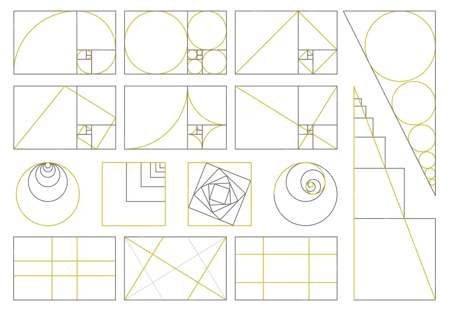
Grids therefore allow for more precise and sharper work and tend towards graphic perfection. We already talked about the rule of odd numbers and the 12 columns, but we still need to mention the Golden number.
You may have already heard about it before, especially in architecture or pictorial art.
Since ancient times, the golden number has represented the perfect proportion, the divine number to be respected in all creation.
Mathematically speaking, there are several golden numbers depending on the figures: in fact, we can find this same perfection in various geometric patterns such as the circle, the rectangle or the triangle. We spare you the calculations that allow you to find this irrational number (in other words, it is not written in the form of a fraction where a and b are two relative integers), but just know that it results from the division of two lengths and that it exists when the ratio between the small and the large part is identical to the ratio of the whole and the large ratio (have we lost you?).
Returning to our graphic sheep, let's say that for many artists and designers, the golden ratio is the secret to successful design, because it is then perfectly balanced and proportionate. It is therefore ideal when creating a design, a logo, a PowerPoint page or even for balancing the content of a web document. It thus forms a real creative reference point and its use in addition to that of grids can provide a clearer vision during visual production.

See you next time?
To conclude, it is important to remember that the creation and production of visual content involves two major processes. Good design must be based on 50% creativity and 50% rigor in execution, by following graphic rules and using standardized tools. To get the perfect result, you have to know how to use your imagination and your seriousness, in equal measure.
In order to perfect your knowledge of Powerpoint, now that grids have no secrets for you, we advise you to look at the subject of slide masks, which already has a complete article.
If you want more early advice, contact us!
See you soon at the Kings of La Prez 👑
Ce qu'il faut retenir
What you need to remember:
- Grids make it possible to establish a rigorous work schedule throughout the creative process.
- Use 12 as the preferred number in your designs
- Use the 3-column rule
- Use the odd number rule


