Manage fonts well on Powerpoint
Discover the hidden meaning of typos and become an expert in unconscious communication!

Between content and form, why choose?
Your message, whether it is for an external presentation, to customers or investors, or internal, to a management committee or to employees, must be clear in its content, but also in the form it takes.
What you have to say deserves to be read, understood and transcribed, and mprez helps you to become memorable, through each of your presentations.
To do this, there is nothing like taking an interest in typefaces, which are so useful, and yet so often overlooked. Typography is multi-sensory, meaning that it affects more than one of your senses and can easily arouse emotions, even before we read the word. We react to typos every day, even if we are not aware of it.
1. Preconceived ideas about typos (because cliches last a long time)
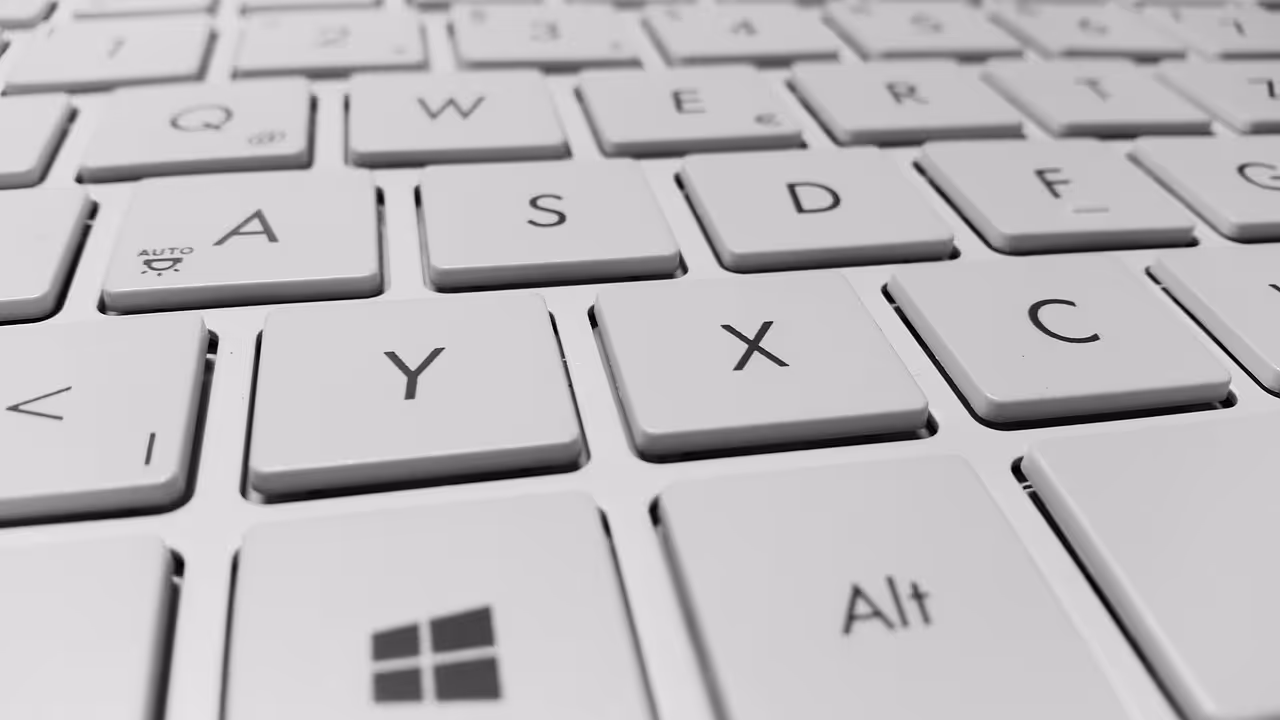
Arial and Calibri, the only solutions? Oh no! And we're not even talking about Comic Sans - which we don't recommend using, given the very poor reputation of this font.
There are hundreds, even thousands of fonts, but the same ones are often used. Why? Lack of time? Acquaintances? Envy? The result is that, more often than not, we take the fonts offered by default and we don't look any further. Because, after all, “If it's legible, that's the main thing, right? ”.
So yes in the idea, but that's not enough.
A typeface is there for bring your idea, your content, your message to life. Neglecting typography is neglecting half of your hard work. Neglecting typography means risking losing some of your interlocutors in a presentation, because they will be too busy deciphering the letters (if you choose a font that is too fanciful such as Papyrus or a Gothic script, for example) or because the fonts chosen will not fit with the message conveyed (for example, if you are communicating a news of the utmost importance in a cursive typeface, with a childish font...).
Just because you're not a graphic designer doesn't mean you should omit this aspect. It is the basis of any presentation, because The eye first attaches itself to shapes, then inquires about the background.
2. What your brain understands... subconsciously
At the turn of a title or text, you find serif typeface (that is, with a series/pads on the bottom of the letters) with fine glides, and your first thought is certainly “The subject must be high and intellectual.” or “The subject must be linked to luxury, to high-end.” That's normal, it's your brain that associated it with fashion magazines such as Vogue, which uses serif typography on its titles and subtitles, or at cultural institutions, such as the Paris National Opera, which uses it on its website.
So, if you want to give a classical and intellectual dimension For your presentation, the use of serif typeface with fine pads is highly recommended.
As another example, you see a poster written in handwritten typography. Instinctively, you will get closer to it, because this typography is more difficult to decipher and brings a close relationship with its reader. Handwritten fonts personify the message and create a direct link between you and the author. They are often used for signatures, too... but a signature is typically used as a link between two people.
Thus, all typography induces a message, and thinking about the scope of its content is essential to effectively choose the font that will serve your text.
3. When typography meets advertising
As a result of these underlying messages conveyed by fonts, there are numerous typographical changes in the communication landscape, and in particular in advertising. Communication experts understand it well, a typo can say a lot!
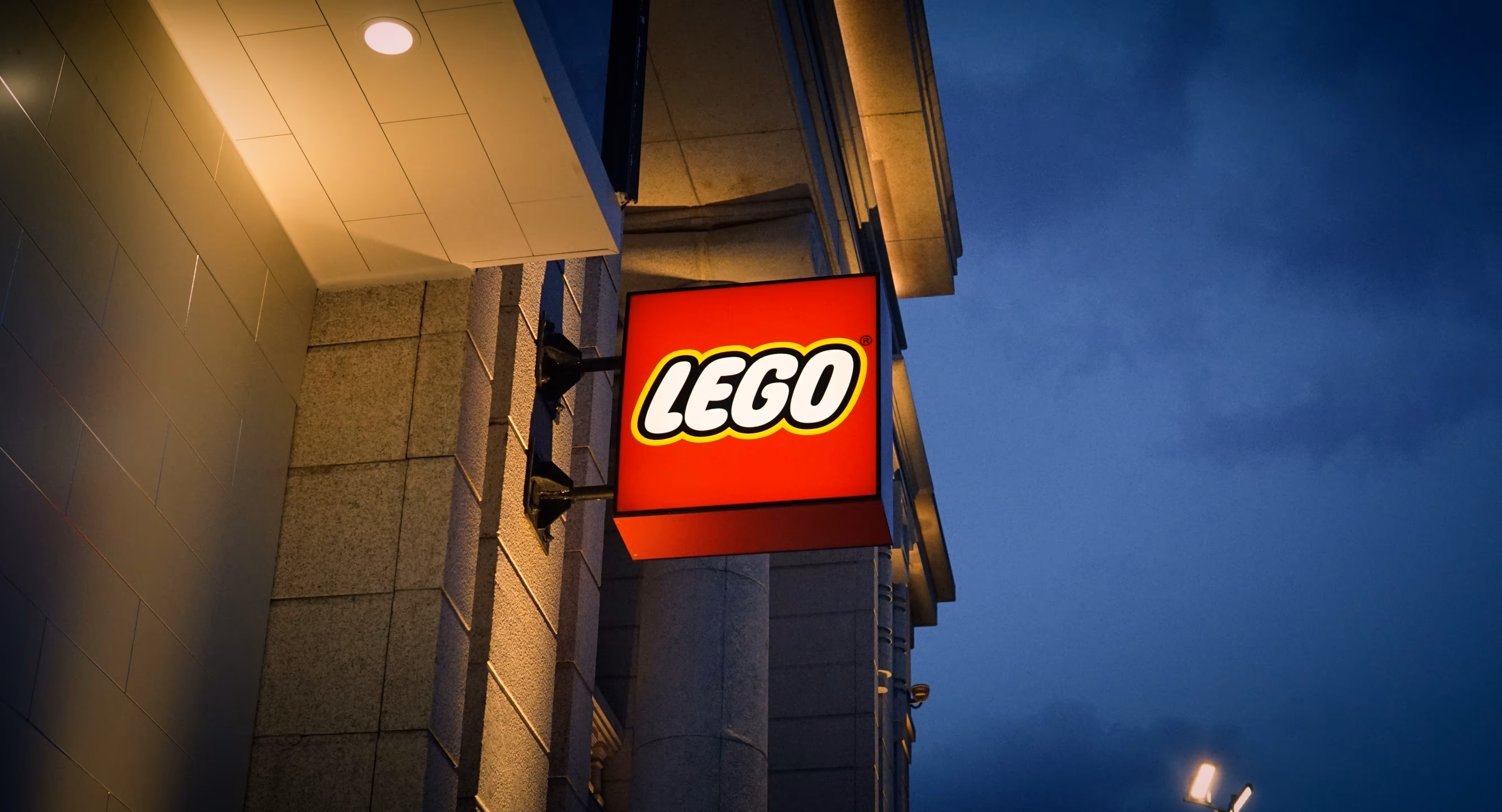
Take the example of the LEGO logo, which underwent a great typographical evolution between 1934 and today.
The first version had a capital font that was very similar to a newspaper header. The font chosen denoted the ease of LEGO consumers and inspired confidence, appearing “noble.”
In 1946, the color appeared in the logo, to highlight each of the capital letters. The journalistic side has disappeared to make way for a game box; instinctively and unconsciously, the brain understands that it is dealing with a toy company.
Finally, it was from 1953 that the LEGO typeface adopted its almost final form, namely a childish, very rounded and stunning typeface, which invites you to play at first glance. This choice allows the brand to be easily recognized and to transmit an immediate message to the consumer.
The typeface will change a bit later, but the spirit will remain the same.
Transmitting a message in one word using a typo is possible; LEGO is proof of this.
4. The technical corner, aka the toolbox
Choosing the typography you want to use for your presentations is good, being able to integrate it is better!
- Indeed, depending on the versions of applications you have, the integration of certain fonts may be more difficult.
The security solution, even if it only offers a limited range of possibilities, is to use a so-called “system” typeface. Thanks to this, you don't have to install a font file on your computer or on the receiver's computer, and the presentation can be delivered raw.
However, one nuance must be made, because depending on the version of the Powerpoint tool, the type library that you will automatically have access to on your software is different. For example, on Office versions prior to 2013, it's best to stick to typos like Arial, Garamond, Georgia, Verdana, Times New Roman, and Tribuchet. This will avoid unpleasant surprises during export.
- If you want Going beyond the scope of “system” typos with fonts that are not necessarily installed by default on all computers, an excellent alternative is to use a Font available from the Google library (integrate a link).
In this case, it will then be necessary to incorporate the chosen typeface into the presentation:
- On the Powerpoint interface, click on File, then Options
- In Registration, check Embed fonts in this file
For it to work, this operation requires opting for a typo in TTF format with an “installable” property, which is the case for all Fonts from the Google library. That is why it is allowed to perform this operation with Google Fonts only.
You can also use Fonts from the Adobe suite, with which the compatibility of fonts on all your supports is promoted. For a rather print-oriented use, Dafont also offers an impressive number of free solutions.
- Did you find, on a random website, an interesting typography for your presentation, but you don't know its name? Some tools allow you to easily find them, based on an image, and show you where you can get the corresponding font, whether it is free or paid.
In addition, you can browse the interfaces of these sites, even without looking for a specific font at the origin, because they have very extensive typography catalogs. Myfonts is certainly the best known seller of fonts, because it works a bit like Amazon.
- Last case: if you want use a font specific to your charter and use it on your document, or if you are working on a project that absolutely requires the use of a specific typeface (other than a Typo system And a Google font) in order to meet the major associated challenge, you will have to “check the quality” of the fonts that must be integrated into the presentation: ensure the file format (TTF), as well as its Faculty of incorporation as indicated above. Some tools available on the web allow this type of conversion.
Breaking News, the typo news
The default fonts evolve like Pokémons!
Microsoft announced that its default font -currently Calibri- was changing! Since July 2023, you may have noticed that the age-old Calibri font was gradually making way for its replacement, Aptos. The latter had been in development since 2021, along with four other fonts developed by the digital giant.
Aptos is a brand new font that is intended to be minimalist, with its unserif lines and clean lines. Soon to be integrated into all Microsoft Office devices, the font was created in order to be the new reference for professional, clear and adaptable fonts to all media.
What is the particularity of this font? Its creator, Steve Matteson, created it by hand at first, and not on the computer, to highlight certain lines that have hitherto not been found in the fonts proposed by Microsoft. You will therefore be able to find in this font thinner lines and circles instead of dots on the “i” (should you take the opportunity to change the famous expression “put the dots back on the “i”?) which, according to S. Matteson, make policing more natural.
Will you be won over by this change?
To go further
In addition to typing and searching for fonts, there are of course the well-known “bold”, “italics” and “underlined” which can be used to highlight your text. However, be careful not to abuse it, because it can quickly make your text illegible!
The greasy, for example, should be used sparingly. If used correctly, it will be used to highlight your most important information. On the other hand, avoid “spreading” your presentations with “fat”, because then, nothing will be highlighted and this will serve your message.
The italics, on the other hand, is used to highlight quotations, proverbs, reported words or words from a specific jargon or a foreign language. Anglicisms, no problem, but italicizing is better!
Finally, with the advent of the Internet, we now use underlining for links. On websites or presentations, be careful about its use, because you expect “clickable” information.
Any questions? Unsolvable problems? Need an expert? The mprez teams are available to support you in the development of your presentations. So, if looking for typos annoys you, leave it to us.
Ce qu'il faut retenir
What you need to remember:
- The brain looks at the form first, then the content, so be careful with your presentation.
- Every human being has a reference system; use it to transmit your messages!
- You don't have to be a graphic designer to choose original fonts; the Internet is full of useful tools.
- Microsoft has revealed a new default font: Aptos.