How to draw up your graphic charter? The practical guide to succeed
Discover how to create an effective graphic charter for your brand: logo, colors, fonts, rules of use.

Have you already come across a brand whose visual universe immediately impressed you? This ability to create a strong and memorable impression in an instant is the whole art of a successful graphic charter.
Much more than a simple choice of colors and fonts, your graphic charter is theVisual DNA of your brand. It tells your story, conveys your values and guides all your communication media. But how do you turn this vision into a coherent system that really works?
Between technical rules and creativity, budgetary constraints and aesthetic ambitions... creating an effective graphic charter is sometimes an obstacle course. However, with the right method, it is entirely possible to design a visual identity that makes an impression and sustainably supports your goals.
Discover our complete guide to building a graphic charter that makes a difference!
What is a graphic chart
One Graphic charter brings together all the rules and visual elements that define the identity of a brand, company or organization. It constitutes the visual frame of reference which guarantees perfect consistency across all communication media.
Concretely, your graphic charter includes your logo and its variations, your color palette, your typography, your iconographic codes, and even the way to use white space. It's the reference guide What are all your employees, service providers and partners following for create supports that align with your image.
Beyond the technical aspect, it visually translates your brand personality. It expresses who you are, what you believe in, and how you want to be perceived by your audience.
Why is it essential?
One well thought-out graphic chart It is not a luxury, it is a strategic investment. It reinforces the recognition of your brand: your customers identify you more easily, even in a dense competitive environment.
It also contributes to building the trust. Controlled visual communication reassures your professionalism and your attention to detail. On the other hand, disparate media give an amateur image that can damage your credibility.
Finally, it simplifies your communication processes. No need to reinvent the wheel for each creation: your teams have a clear framework that speeds up production while guaranteeing quality.
The key elements of your graphic charter
The logo: the cornerstone of your identity
Your logo is often the first element we think of, and for good reason: it's the symbol of your brand. A good logo should be memorable, adaptable, and timeless. It should work just as well in a large format on a facade as in a small format on a business card.
Define its rules of use precisely: minimum sizes, protective spaces, monochrome versions, variations for colored backgrounds. These technical constraints ensure that your logo maintains its impact in all situations.
Don't forget the formats: your logo must be available in vector (for printing) and in high-resolution bitmap (for the web). Also, provide a simplified version for very small sizes or constrained applications.
The color palette: emotion through color
The colors convey powerful emotions and messages. Your color palette should be both consistent with your positioning and rich enough to use all your supports.
Define your primary colors (2 to 3 maximum), then your secondary colors that enrich the palette. For each color, specify the exact references: Pantone codes for printing, RGB codes for the web, CMYK codes for offset.
Remember to test your colors on different supports and under various lighting conditions. A color that works on the screen may look different when printed, and some colors lose their impact under artificial lighting.

Typography: giving your brand a voice
Your typographical choices directly influence the perception of your message. A serif font evokes tradition and reliability, while a modern sans serif font suggests innovation and simplicity.
Select A main family for your titles and a secondary family for your texts. Watch out for them compatibility And to their readability on all supports, from print to mobile. Choose fonts that are available in several weights and styles.
Define a clear typographic hierarchy with rules for each level of information: sizes, weights, spacings. This systematization ensures perfect consistency in all your documents.

Before creation: the foundations of your graphic charter
Define the identity and values of your brand
Before any visual design, brand identity must be clarified. Ask yourself the right questions: what is your mission? What are your brand values? Is your tone serious, playful, or innovative? Who are you talking to? Better defining your personas helps you to translate these elements into coherent graphic choices.
For example, a brand committed to the environment will favor natural colors, while a tech startup will dare to use daring shades. This reflection avoids the differences between your message and its visual interpretation. A company focused on innovation will be able to incorporate geometric shapes or dynamic gradients into its logo, reinforcing the image of modernity. On the other hand, traditional crafts will opt for classic fonts and warm colors.
Analyze the competition to better differentiate yourself
A competitive analysis reveals the visual codes of your sector. Look at the logos, palettes, and styles of your direct and indirect rivals. The objective? Be inspired by it or, better, stand out from it with a unique positioning.
If all your competitors use blue tones, dare to use yellow to stand out from the crowd. This strategic approach reinforces memory. Remember: your charter should reflect your uniqueness, not disappear into the landscape. To do this, use tools like competitive mapping to identify an unoccupied visual niche or perceptual mapping to understand how consumers perceive brands based on visual criteria. These methods help carve out a tailor-made visual identity.
Write precise specifications
The specifications (or creative brief) focuses your strategic thinking. He Guide the graphic designer by clearly defining your clear goals : targets, supports (web/print), spirit of the logo, technical constraints and examples of inspiration.
Include details like expected file formats (vector vs. PNG) or what's not allowed (logo distortion). This document avoids misunderstandings and ensures that every visual element aligned with your DNA. Without it, you risk excesses that are costly in terms of time and budget.
Structure it by including key elements: company presentation, clear quantifiable goals, targets (age, location, interests), list of media (site, social networks), constraints (contrast, accessibility), constraints (contrast, accessibility), budget and deadlines. A detailed brief speeds up collaboration and reduces back and forth.
The 7 key steps to build your graphic charter
Step 1: Tell your brand story
Your graphic charter should start withYour company's DNA. Describe your mission, values, and history in a few lines. This visual story creates an emotional connection with your audience. Your graphic choices (colors, fonts) should reflect this identity.
A company focused on ecology will favor natural tones, for immediate coherence. This foundation avoids arbitrary aesthetic choices. For example, a craft business could include a short text about its family roots, accompanied by warm colors reminiscent of wood or earth.
Step 2: Choose your color palette
Limit yourself to 3 to 4 main colors to avoid visual overload. Specify their CMYK (print), RGB, and HEX (web) codes for consistent use. One study shows that a good choice of color can Increase brand recognition by up to 80%.
Respect a minimum contrast of 4. 5:1 for text, according to RGAA standards. Pink #FFC0CB on a white background is more legible than #C0C0C0 on a gray background. Use tools like Coolors to generate accessible palettes. For example, the dark blue #003366 conveys trust, ideal for a bank, while the orange #FFA500 evokes creativity.
Step 3: Select your fonts
Choose 2 to 3 fonts maximum : one for the titles (ex: Montserrat), one for the body (ex: Open Sans), one for the quotations (ex: Cinzel). Check their user licenses: Google Fonts Suggest fonts royalty-free, ideal for websites.
Avoid decorative fonts in official documents. For digital media, opt for optimized web fonts such as Adobe Fonts. A luxury brand could combine an elegant title font (Playfair Display) with a simple sans serif font for text (Lato).
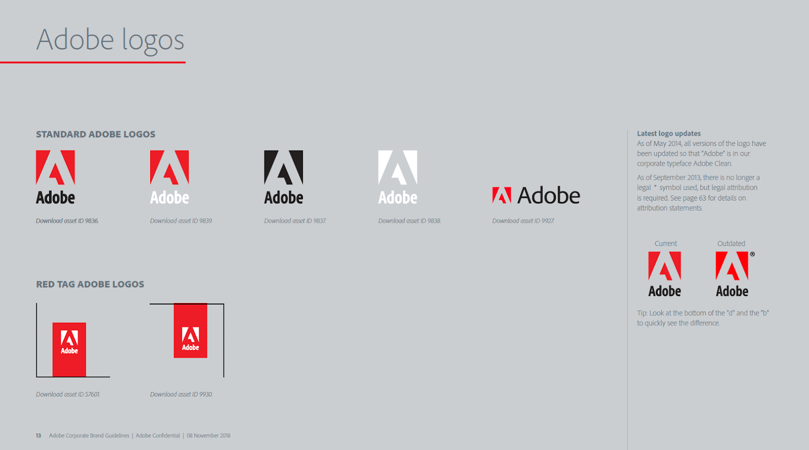
Step 4: Define the rules for using your logo
Your main logo should be available in horizontal, vertical, monochrome versions. A protective zone equal to the height of a letter should surround it. Prohibit its deformation or the addition of reflections that could make it illegible.
For example, for Spotify, the green #1ED760 logo is mandatory on a white background, with a minimum size of 20 mm for print and 70 px for digital. Include technical diagrams: one image showing the protection zone, another illustrating the prohibitions (altered color, deformation).

Step 5: Integrate other visuals
Set a consistent photographic style: soft lighting for a wellness brand, bright colors for a tech startup. Use icons with rounded corners if your logo has this characteristic. Websites with a Uniform iconographic style keep visitors longer.
For illustrations, prefer geometric patterns if your identity is modern, floral for a natural positioning. Women's fashion companies could impose diffuse lighting and smiling models, while a sports brand would use dynamic shots in action.
Step 6: Establish layout rules
Set minimum margins (1.5 cm in A4) and 1.5 line spacing for text. Apply the rule of thirds by placing key elements at theoretical intersections.
For web materials, respect white space representing 30% of the page, avoiding overloading. The titles remain aligned to the left for smooth reading. On posters, use a 3-column grid to structure information. On the web, adopt Flexbox or Grid CSS grids to align the blocks.
Step 7: Plan the variations on the communication media
Predict templates for each medium: web banners (1920x1080 px), business cards (85x55 mm), Instagram stories (1080x1920 px). Test the legibility of your logo on these formats: it must be recognizable in 3 seconds maximum. Brands with complete graphic chart generate more immediate recognition.
Include a sample Facebook post with your color codes and fonts. For social networks, create templates Canva downloadable. For email messages, set fixed headers and footers.
Mistakes you should definitely avoid
The pitfall of excessive complexity
A graphic chart that is too complex becomes unusable on a daily basis. Avoid 15-color palettes, mixtures of 5 different fonts, or logos with invisible details in a small format.
La Simplicity is a guarantee of efficiency : a simple but perfectly controlled charter is better than a sophisticated system that no one can apply correctly.
Neglecting technical constraints
Your charter should work in the real world, with its budgetary and technical constraints. A special Pantone color is expensive to print, a proprietary font causes licensing problems.
Anticipate these operational constraints from the design stage. Choose robust solutions that work in all contexts, even the most constrained ones.
The oblivion of scalability
Your brand will evolve, so will your communication needs. Design a charter enough pliable to adapt to these changes without requiring a complete redesign.
Plan possible extensions: complementary colors for special events, sectoral variations, adaptations for new digital media.
Implement and bring to life your graphic charter
The strategic deployment phase
The success of your graphic charter depends largely on its good ownership by all your teams. Organize presentation sessions to explain the issues, rules, and expected benefits.
Create practical tools: PowerPoint templates in brand colors, standardized email signatures, visual kits for social networks. The more ready-to-use tools your employees have, the more naturally they will respect the charter.
Designate a graphic charter referent in each department. This person becomes the preferred contact person for application questions and ensures compliance with visual standards.
Quality control and support
Set up a process to validate important creations. High-visibility media (advertising campaigns, exhibition stands, website) deserve greater control to avoid harmful discrepancies.
Organize regular meetings with your teams to identify application difficulties and provide solutions. This feedback from the field is valuable for developing and enriching your charter.
The continuous evolution of your visual identity
A graphic charter is not set in stone. Plan periodic reviews to adapt it to changes in your brand, markets and visual trends.
These updates can be light (adding new colors, enriching the templates) or more substantial (redesigning the logo, changing the palette). The important thing is to maintain consistency while maintaining a modern and relevant identity.
Also keep an eye on the new communication media : augmented reality, new social platforms, emerging advertising formats. Your charter must be able to adapt to these innovations to remain effective.
Creating a successful graphic charter requires time, thought and a methodical approach. But the investment is worth it: a coherent and striking visual identity becomes a real competitive advantage that reinforces your image and facilitates your communication.
The challenge is not only aesthetic, it is business. A well-thought-out graphic charter makes you gain in efficiency, consistency and impact. It unifies your teams around a common vision and simplifies your creative processes.
Do you need support to integrate your graphic charter into your PowerPoint presentation? Our mprez experts are there to advise you!